Billie Jean - 'Introducing 30 Years of Nike' Vandal shoe poster
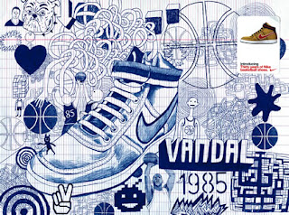
Billie Jean, who works in East London, is a very skilled craftmans in the field of illustration. He was commissioned to promote the new editions of the Nike Vandal Basketball shoe which resurfaced during 2004. It is called Vandal because in 1984, a rookie 'baller'(Michael Jordan), showed up to an All Star game with his custom signature warm ups. M.J was fined every single he attended due to his shoes being 'too colourful' and conflicting with his teams colours. He put a 'X' with the word 'BANNED' on the his 'sneaker'. The shoe he 'vandalised' was the a pair of High Air Force 1's, thus giving birth to the Vandal which was released in 1985, the year M.J was drafted. At the time the shoe was released, it became fashionable and evntually, a classic in its own right. The theme for this piece of work is basketball. Billie Jean intentions was to promote Nike's basketball shoe campaign celebrating 30 years of basketball. There is a lot of symbolism used in reference to the historical background of the shoe and its relation to its theme. Such symbols used are a Space Invader and a Rubix cube. These were used because during 1985, Space Invaders and Rubix cubes, invented during late 70's, became very popular. There are a lot of references to Michael Jordan, one being quite obvious. Other symbols such as a peace sign and a heart suggest the love for the game and that it brought about a particular type of peace to those who participated in the game. The are linear scribbles in reference to the tactics and dynamics of basketball. At the top left corner there is a small illustration of a man and a bulldog which is in reference to Billie Jean himself. And finally, the main focal object which glues this whole image together is the Nike Vandal shoe. The structure of this image is similar to of which you will find in a teenagers notebook; full ideas and thoughts which have been translated into scribbles and illustrations by using a biro ben due to boredom in a classroom. Billie Jean used biro pen with great skill to create deep lines, precise form, excellent texture, and organised space. A prime example of such formal elements are seen in the Nike Vandal which is positioned in the middle to draw attention. The spacing is very tight and compressed which also suggest the dynamics of the basketball game. At the time this was made, the Nike Vandal was loosing attention, and so the company decided to release new and exciting editions to boost the shoes sales. In order to do this, they realised the 'Introducing 30 years of Nike' Campaign. The campaign gave a renovated insight to classic basketball shoes. Not only was the Nike Vandal popular with the sports industry, it became popular in street fashion and dance.I chose to analyse this particular illustrator because it combined three of my favourite things - 'vintage' era, trainers and illustration.
Nike Air Max LeBron VII - More Than A Game series illustrated by Billie Jean
Dave McKean - Social Work Poster
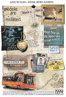
Dave McKean, an English Illustrator, photographer, comic book artist, graphic designer, filmmaker and musician, is the designer behind this advertisement poster titled ‘Sonya’, which promotes the benefits of getting involved into social work. Dave McKean is very well known for his illustration skills, so its clear he decided to use a combination of a comic book and map theme to tell Sonya’s story who has been struggling with difficulties and how her life was changed around by social work. The message is ‘ people can be fascinating, mystifying; rewarding, social work is work with people. It’s that simple and that complicated.’ Sony’s journey starts of with a single house icon with the words people are isolated, which moves on a to a picture with the caption born with mild spinal damage and moving onto a direction pole with the words Sonya is hard to reach. The single house icon, picture and direction pole suggests that she has been different since birth and she’s realised this but in a negative way so she is ‘hard to reach’. There is another picture with the caption ‘at 37, Sonya is now recluse’ and a gold heart locket with the words ‘mum did so much for her, maybe too much?’ It’s clear that at this stage of her life, Sonya became totally isolated and independent on her mum. The locket suggests that her mother’s love had taken away her dependency and when her mother died, she ‘needed lots of help, but mostly she needed to help herself’. Social care got involved but their first visits were spend talking through her door. A little note underneath a picture of a blue door with the words its just too soon to let anyone in suggests how she was coping with this new situation. Further on the route, it says but your patience and a shared passion can help Sonya open up. A picture reference of Coronation Street, a program of a community’s life, and case files of people who have been in her shoes suggests that she’s slowly opening up. ‘Eventually she agrees, but only if you take her by taxi and when Sonya gets the bus on her own, you know she’s really getting somewhere’ is depicted by a taxi card and picture of Sonya on a bus, which suggests she’s finally becoming more independent. The journey ends with neighbourhood of houses and compass, meaning that she’s part of a community now and that ‘one day, Sonya will help show someone else the way’.
Lee Clow - Pioneer 'seeing and hearing like never before' campaign poster
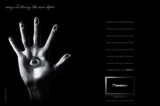
The company TMBWA/CHIAT/DAY based in LA, USA, were called upon by Pioneer to promote their latest product, The KURO line of plasma television and monitors. The ‘seeing and hearing like never before’ campaign was lead my worldwide Executive Creative Director Lee Clow, along with creative director Jerry Gentile, copywriter Gage Clegg, art director Becca Morton and photographer Nadav Kander. The image, part of a surrealistic print series, uses a lot of symbolism to promote the plasma T.Vs. The theme behind this is the senses. The company decided to use symbolism and surrealism to capture the attention of the viewer and help the KURO plasmas gain recognition. The image in the middle is of a hand with ears as its fingertips and an eye in the middle of its palm; similar to that of a creature featured in the movie Pan’s Labyrinth, which was released in 2006. Further more, in North Africa, its like a palm shaped amulet called Hamsa or khamsa is used for protection in warding off the ‘Evil’ eye’. ‘Look in ways you didn’t know you could. Hear in ways you didn’t know existed’ relates to the campaigns name.‘ Where you eye bites into a red so juicy it explodes in a gush and runs down your cheek’ explains why there is mouth positioned inside the eye and ‘ Where every image can be tasted, every note can be felt and every experience is magnified in ways you can hardly imagine’ explains why the ears and eye have been placed on a hand. There is a lot of space between the name of the campaign along with the image on the left, where as the description and an image of the T.V are on the right. This was done so that the image wasn’t over crowding with information; it allows the viewer to direct his/hers attention around the poster. A black and white colour scheme was chosen to convey The KUROs stylish and sharp design and to create tone giving the image a shocking and mysterious mood. Digital editing software such as Photoshop or PhotoPlus would of have been used to manipulate the image, colour a detail of this image. This campaign came out in 2007, and it turned a lot of heads around due to is surrealistic and strange visual campaign. I’ve always been drawn to such weird and imaginative visual advertisement because I find it inspiring how combinations of things/objects can bare fruit to such a new and exciting concept.
Jenny Tran - Fabric of America

Jenny Tran, a cultral femal artist, titled this piece 'Fabric of America', which conveys her ideas about 'The War on Terror' and its effect it had on the world's perception of America. Jenny Tran based this piece on patriotism. At first glance, its assumed that this is just another interpretation of an Americans pride on their flag. However, at closer expection, its clear that she is conveying her thoughts on the 'Fabric' of America. As the title suggests, her message is clear; 'Intolerance destroys the Fabric of America'. Jenny Tran manipulated threads of anti-muslim chat rooms to appear as if she's frayed the material of an American flag, and saturated the flags colours to an acid wash look to suggest that America's intolerance is wearing down America's infrastructure. She has used a low tone, multi directional lines and spacing to metaphorically portray what the title states and suggests. Proffesional editing software such as Illustrator has been used because of how she's managed to edit the flag's colours and framework. The events of 9\11 left America and the world in shock, but what was more shocking were the conspiracy accusations which lead George Bush to declare a 'War on Terror'. Jenny Tran provoks the thought of this declration was made due to Americas intolerance to accpet responsibility for their participation on events that lead to 9/11. Artists and designers have always provoked a lot of thought through their work, and this is a prime example. This is interesting to me because she's not only expressed a personal thought, but an idea a lot of people started to believe in during the effects of 9/11. Graffiti artist Saber did his own interpretation of the American Flag and just like Jenny Tran, was heavily criticised.
Jamie Reid - Sex Pistols, God Save the Queen single poster
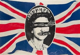
Jamie Reid, is a British artist and anarchist. He is best known for his work in the field of Decollage, famous example is his 1977 poster design for Sex Pistols single, 'God Save the Queen'. Reid has used the theme of Patrotism, similar to Jenny Tran, to convey his thoughts on his native nation. Being an anarchist, he 'vandalised', as some may say, a picture of Queen Elizabeth II to promote the Sex Pistol's single. His design, based on Cecil Beatons photograph of the Queen, had been modified with a safety pin through her nose and swastikas in her eyes, which was then modified again. Reid decollaged the picture and covered the eyes and safety pin with the words God Save the Queen and Sex Pistols. He centred the potrait photo on a brightly coloured British flag which reflects the initial thought, (the Queen), England is famously centred upon. It also suggests how vibratnt Britain was becoming to the world due its involvement in the Punk rock movement. He used decollage to create texture by adding on words in a ransom note form to portray the common perception of British Monarchs as aggressively commandative and ruling. He used the difference between the tone of the picture and colour of the flag to draw attention to the name of the band and their single and giving the viewer a focal point. The decollage was then later scanned in and then manufactured into print series to help the Sex Pistol's single gain recognition. At the time it was made, British musicians Sex Pistols were making an international name for themselves due to their participation in the Punk Rock music scene. England, or Britian is commonly known for their Monarchs, and so, what better way for the Sex Pistols to become more famous. I find that this piece of work is effective because of how the designer has used stereotype in a positive way to promote his clients identity; it was described as 'the single most iconic image of the punk era' by Sean O'Hagan of The Observer.
Shepard Fairey - OBEY sticker
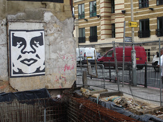

Shepard Fairey is the creator behind the Obey Giant logo sticker, which was spotted in Angel, London in May 2006. Shepard Fairey uses whit pasting to erect these stickers. This sticker concerns itself with the use of propoganda on how an individual relates himself to his surroundings. The theme behind this is propaganda symbolism. 'The OBEY sticker attempts to stimulate curosity and bring people to question both the sticker and their realtionship with their surroundings'. There is no message to the OBEY sticker but its purpose is simply to cause a reaction; whether its a negative or positive interpretation, it shows an insight on the viewers personality and "nature of their sensibilities". The logo was originally named after the wrestler Andre the Giant, but than was stylised to what it is now known as the OBEY Giant. Its a simple black and white vector image which, by some, have been peeled down because, as Fairey stated, to the PARINOID OR CONSERVATIVE VIEWER, they would responde in that way simply because they feel it is a petty act of vandalism. However, shepard has also made a clothing line out of OBEY, and has become a trend which he has described as another phenomenon; 'a CONSPICIOUSLY CONSUMPTIVE nature of many members of society'. Ironicly, we're forever bombared by such designs which eventually becomes so common that people demmand to have it in some shape of form just to have a sense of belonging. The stylised sticker, has symmertical shape, space and propotional value which creates such a simple image that the viewer questions the motive behind it. To create such a simple and symmetrical icon, a program such as Illustrator would have been used. The sticker has been weat pasted on to the wall because its an easy and cheap way to quickly erect an image onto a wall; although it seems to have been slightly rushed due to the insecurity of been caught red handed with 'vandalising public property'. During 2006, specifically around the months May and Septemeber, Fairey spent a lot of time in the UK weat pasting the iconic symbol around London, Newcastle, Middlesborough and Brighton. Not only was he promoting his logo, he was also promoting the OBEY clothing line and Fine Art at exhibitions. He's work has been involved in skateboarding and graffiti culture, which then developed into street art and propaganda. He was recently sued for a photograph he used without permission to promote Obama's campaign for presidency. I find Shepard Fairy as one of my most influencial designers because of his concept behind OBEY, which is similar to what I strive to implicate with my designs and illustrations.
Dave Gibbons - Watchmen Cover Art
British Illustrator Dave Gibbons, along with writer Alan Moore and colourist John Higgins, is famously known to all 'comic book nerds' as the man behind the illustrations of the graphical novel, Watchmen. This particular image is of the Cover art for the 1987 U.S collectible edition of the first part, out of twelve, of the graphic novel Watchmen, which depicts a shattered and blood stained appartment window. The theme behind this is mystery. Gibbons intentions were to stir thought and curiosity in the viewer and question what this scene is about. The cover art is the actual first scene of the graphic novel; its the crime and death scene of Edward Blake or as the world know him as the superhero The Comedian, who is one of the Watchmen which thrown through his appartment window and fell to his death and if you look closely, you can see a blood stained smiley face badge that belonged to The Comedian. This scene is very important because its this event which set the Novel into Motion. Dave Gibbons had cleverly illustrated the scene in first person; he's captured the viewer into believing that they're standing in that room looking out the bloody shattered window. Dave Gibbons used fine lines to layer the image so that it created a 3D scenario which he reader is instanly put in. Gibbons' artwork in Watchmen is distinguished both for its bleak use of the formulaic comicbook nine-panel grid layout and also for it’s intense narrative and symbolic concentration which can be seen through out the novel. Alan Moore's idea was to create a graphic novel based on the idea of superheros living in a credible, real world and that they too can die. Moore's idea is opposed to the general perception of superhereos being these powerful and indestructal people. The title was inspired by the quote: 'Quis custodiet ipsos custodes?' which translates to 'Who watches the watchmen?'. The quotation is taken from Roman Poet Juvanel's Satires and it commonly related to Plato's philiosphy of politics. Gibbons Cover art for this first instalment perfectly depicts Moore's idea. I chosethis particular piece of Gibbons artwork because I find his ability to illustrate such a complex concept. Although, hes only responsible for the line work, it's fair to say hes executed his job well.
Yula Brodskaya - Cadbury's advert
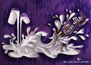
Yulia Brodskaya, born in Russia (Moscow),is the designer behind this artwork. She has been interested in diverse creative practices ranging from Textile Painting, Origami and Collage to more traditional Fine Art. After leaving University with a MA in graphic design, she continued to experiment and explore ways of merging all the things she likes most: typography, paper, and highly detailed hand-made craft objects. Her innovative paper illustrations, or papergraphics, and beautifully detailed paper designs has gained her a reputation which allowed her to work for clients all around the world, such as Cadbury's. This image is of her artwork for Cadbury's Chocolate which was used as billboard advertisement in Ireland. She was commissioned to one of the three executions and 'capture, in a simple, visually evocative and iconic way, the journey of a glass and a half of milk into a bar of Cadbury Diary Milk'. Yula's used her skill carefully demonstrate her clients brief in a 3 dimensional manner. Cadbury's have used the colour purple as part of their identidy and so it was only relavant to use this colour in the background. Shes used different tones of purple to create a textured background. Brodskaya has concentrated her papergraphic skills on capturing the milks journey into the chocolate bar. As you can see, her exprience in her paper illustration allows her to lift and create a 3dimensional focal point attracting the viwers eye. Cadbury's was founded almost 200 years and gain popularity rather quickly. It then launched its world famous Dairy Milk bar in 1905 in a purple package which later become iconic, not only for its taste but as well for its presentation. Yula Brodskaya was chosen due to her craftsmenship and paper graphical skills. Her work is inspirational because she has demonstrated that the paper can be used to create expolive form and flowing beauty rather thatn just being a canvas.
Ian Wright - T.I, Paper Trail album cover
The British native illustrator Ian Wright, has gained a reputation in working in commercial design over his four decades of being involvmented in that industry. This particular image is a pciture of a Billboard advertisement placed in Shepards bush promiting the U.K release of T.I's album, 'Paper Trail' on Novemeber 24, 2008, which was alose used for T.I's album cover. Wright's intention was to create a design which promote T.I's album. In American Rap termonology, the phrase paper trail is used to reffer the rapper's motivation for money. Ian wright had to relate the albums title to the design, and so, he created a design based on the theme paper. Wright used different coloured scrap paper such as notepad, plain white and magazine paper,to collage a potrait of the American Rapper. He specifically chose to keep a minimal degree of coloured paper so that he didn't create a busy and overcrowded design. He demonstrated the potraits tone by using black and grey shades of magazine scrap paper to create 3D form. Although hes also embedded differnt coloured scrap paper together, as well as spacing and layering the scrap paper to create texture, T.I facial expression,which can be described as motivated, is still recognisable. The actual billboard advert had pieces of paper curling out as if the glue wasnt strong enough to keep it flat. Wrigtht used collage for this design to convey a rappers motiviation and dream to have layers of money building on top of each other. The American rap scene is generally all about money - the more money you have, the more your status goes up. Commercial rap has left people to believe that rappers are only motivated by money, because that is what they generally focus most of their songs on. This design could of been collaged by money, but instead actual paper was used to oppose this stereotype. I chose to annalyse this design because I was interested in how Ian Wright had masterfully used collage to create such a different and memorable piece of work.
Oscar Wilson - J Dilla
 Illustrator Oscar Wilson is known in the Graphic world for his exceptional work in image creation and hand crafted typography. He founded Studio Oscar in 1996, which produces work for a wide variety of clients, with commissions from advertising, fashion, publishing,retail design, film and TV. Oscar wilson uses a lot of calligrams in his work. One example is his J Dilla calligram which was used to promote 'J Dilla Changed My Life', a music Event held in Kings Cross Scala on 6th of Febuary, this year. The theme is what made J Dilla, J Dilla, and that was his music. Oscar Wilsons intention was to pay homage to the Musician but also to promote the music event. The calligram was done by using the names of J Dilla's albums which suggests that the fabric of this man's reputation was made up from his exceptional music. Oscar Wilsons calligram is a potrait of the deceased musical artist which was filled a colour scheme of three, red blue and peach, He's also used a white background so that Jay Dee's face is put out there. Wilson skill is noticable by the fact he was able to maintain J Dilla's facial construction. The former Dj, died but he is know for his legacy - his music. Those who appreciate J Dilla would know that he made the music, but in a way, it made him famous because of his musical capabilities. As well as being interested into illustration, I am also interested in tattoo's and typography, so I chose this artwork because I find how he manipulated typography into shapes and yet keeping the framework of Jay Dilla's face in tact intriging. Not only am I fan of Oscar Wilsons work, I am also a fan ofJ Dilla's music. Both, the graphic design, and insipration for the graphic design have been combined to create an outstanding and memorable artwork. The design is has also been used a t-shirt print.


