Illustration mind map I made to brainstorm ideas which I could use illustration for -
Specific Mind map
A specific mind map of what I narrowed down my thoughts and ideas on
Specific Mood board
This is just a collection of images that I have found to be inspirational and intact with the combination and alliances theme.
Exam brief
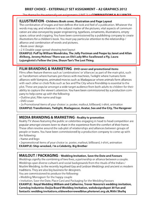
My exam brief analysis
Seeing as I have a strong set of illustration skills, it was reasonable and logical to chose the Illustrations brief. However, for this illustrations pathway brief, I chose to modify it to accommodate my personal interests. So, I have chosen to create a small brand that specialises in illustrative t-shirt designs. The outcomes I will create are
-a logo,
- an original typography
- an original typography
- 4 different illustrations
which will be used for t-shirt designs. I am going to base my illustrations on sayings and phrases that have inspired me through out my life and will be a combination of text and image to relate to the Combination and Alliances theme. I love using fine liner/pen and using different materials to illustrate on, so for I have chosen to experiment with a range of materials including brown parcel paper and a white sketch pencil to add detail and also use lino prints on paper/fabric. I would also digital application to create a neater and stylised illustrations. I will be research illustrator Mike Giant, Andreas Pries and brands such as Rebel 8, Ed Hardy, Treacle Clothing.
Influential brands, illustrators and logo's
Mike Giant & Rebel8 Logo

 Rebel8 was founded in 2003 and is a San Fransisco clothing company who are known in the skateboard, graffiti and tattoo culture. The REBEL8 brand is one of the last authentic streetwear brands left that incorporate original artistic works within their pieces. Most graphics within the REBEL8 product line are hand illustrated, with no computer generated enhancements or manipulations. The man behind this original art work at REBEL8 is the legendary tattoo and graffiti artist Mike Giant. - Rebel8.com The brand is ran by Joshy D, a close friend of Mike Giant who have known each other since the 1990's who share an share a passion for tattoos, graffiti, metal and hip hop.
 Originally, the logo was drawn as a text logo saying 'Rebel8', with a swoosh extending from the 'R' underneath the rest of the letters. The logotypes of two British motorcycle companies: Norton and Triumph are what gave Mike Giant partial inspiration to create the text logo. Joshy D explains how the current logo was formed:Around 2006 I started becoming bored with that logo, and then on this one graphic Mike did I looked really closely and there was this little eight with a diamond in it, and I said, 'This looks pretty cool.' And I asked him if he could redraw it and make it a bit bigger."
Giant continues:"Our '8' logo began as a tattoo on a drawing of a girl. It was a happy accident. It's become a real brand identity for us, and personally I relate our '8' to Buddha's Eightfold Path, something I've found great benefit in pursuing."
Joshy D mentiones that "the eight with the diamond isn't going to be replaced easily, or soon. As Joshy D points out, over 100 people have had it tattooed on their bodies in homage to their favourite streetwear brand. And with growing success, why change something that works?" "Most of our ideas come from the lives we lead. That's the essence of lifestyle branding," explains Giant. "We're making what we want to wear. Luckily enough, people are feeling our style and buy our stuff."-
"Most of our ideas come from the lives we lead. That's the essence of lifestyle branding," explains Giant. "We're making what we want to wear. Luckily enough, people are feeling our style and buy our stuff." - Quotes the Rebel8 brand is all about the things that Giant and Joshy D love
The Rebel8 brand is all about the things that Giant and Joshy D love. Mike Giant style is very particular, as he has a strong background in graffiti and tattooing which has gained him a reputation amongst graffiti and tattoo artists. He has an amazing attention to detail as he illustrates all the brands designs by hand using black sharpie pens – a tool he has been using for many years. Mike Giant also illustrates canvases and murals, some of which he includes in his exhibitions.
Here are just a few pictures I found here of Mike Giants "Don't Come" Exhibition in Melbourne back in 2007.
I absolutely love Mike Giant's illustration and style. I admire his attention to detail with everything he illustrates and that all of his designs are hand illustrated with a sharpie pen. Most of his work is black and white, which I think keeps his style of illustration stylish and classic. What I love about his work is that he combines everything he loves to create something unique.
Hydro74
I was introduced to the Behance Network where I spend some of my spare time looking for inspiration and I came across Joshua M.Smith, a Orlando based designer who goes by the name of Hydro74. Hydro74 specialises in such creative fields as Typography, Illustration, Graphic Design, Digital Imaging and Design.
"Typography is far more than just a simple addition to a product or brand, it is what sets the tone for the entire piece. Each letter has a way of reacting and uniting to form meaningful, powerful words that embrace a sense of emotion or power. With that knowledge, producing pieces that best represent the needs is what Hydro74 prides itself on to help other brands find their identity and voice, philosophically and aesthetically."
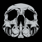 He owns Legacy Of Defeat, a unique custom display of typography founded by Hydro74 where you will find new and exclusive typefaces as well as a collection of free typefaces put together by Joshua M.Smith. The way I would describe his typography is "grungy" and "gothic', type faces which you'd find on skate branded t-shirts. Although the typography styles share similar themes, they are creative, detailed and diverse in shape styles of lettering. His illustration skills are definitely nothing less than excellent and well executed. His consistency in attention to detailed whether he is using markers on different surfaces, or using Illustrator. Just like Mike Giant, he has a natural talent when it comes to using pens and markers as shown here:
MISHIMOTO vs. HYDRO74
"Complexity and a fluid organic approach is what is highly valued in each and every piece. A Illustration to me is something that tells a story with out words needed. It builds a bond with the viewer who will either get it, or find it horrible, yet, the interaction is what is desired when doing a piece. Some Illustrations are trend based iconic structures meant to embrace the masses to encourage sales, while others are explorations turned to symbolic ideas on paper or fabric. Illustration is something I find deep meaning in."
What J.S.M says about his view's on illustration is very inspiring to me because I try to make an impact with every drawing/illustration/design I do. I want the viewer to look beyond what the image is and provoke thought and curiosity in them. By doing this I wish the viewer to question what their relation is to the design.
Ed Hardy
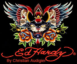 Don Ed Hardy is an American artist born and raised in Southern California and born in 1945 in Corona del Mar, located in Newport Beach in California. He has a Bachelor of Fine Arts in printmaking as well involving himself in painting, drawing and tattooing. He was a student of Sailor Jerry Collins, a well known tattoo artist recognised for tattooing sailors. Through this association , Ed Hardy was able to study with the Japanese classical tattoo master Horihide in 1973. Ed Hardy style was recognised for combining Japanese Tattoo aesthetically and technique into his American style of work.
Ed Hardy's style of art work incorporates Irezumi, is a form of tattooing. The word is Japanese which is used when referring to the insertion ink under the skin.
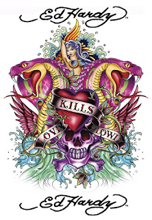 What I've noticed about Ed Hardy's work is that his work is highly detailed but not because he draws them in detail, but rather the detail lays in how he has applied the colour in his design. The colours involved aren't solid but they are gradient's of different colours that great aesthetically pleasing and exciting tattoo/illustration designs. These images on the left are two examples of designs I feel that show this point. As you can also see is that he's designs show symmetry which I feel is definitely an important factor into making such designs beautiful.
I would say that these particular designs were coloured in Photoshop or some sort of software that sepcialises in digital painting such as Corel Painter 12. The context of the designs are also typical subjects found in modern tattoo designs such as snakes, roses and skulls. In the second image, you can see it has text in a typical tattoo typeface and found on a waving banner, another common thing found in modern tattoo's. Both designs also have wings, and incorporate hearts in their designs, another thing that is generally found in modern tattoo designs. Ed Hardy's signature is also found in almost every design he does.
I haven't really liked Ed Hardy's designs mostly because of the repuation
Andreas Pries
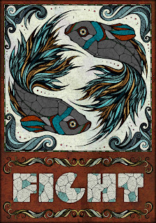
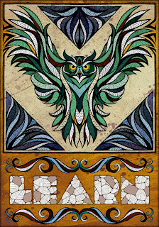 Andreas Preis is a German freelance Graphic design and Illustrator. I found him on the Behance Network and was immediately attracted by his style of illustration.
I find his work highly inspirational, and exceptionally detailed. His attention to the detial he adds on to his illustration is amazing. Looking through his work, these two illustration posters stood out from the rest because of what he incoopertated in the illustrations. Owls, being one of my favourite animals are considered to represent wisdom which is why I think the word learn has been placed underneath - you learn from experience thus gaining wisdom. The other illustration intrigued me because of the fish, which look like Koi fish. According to Japanese legend, if a koi succeeded in climbing the falls at a point called Dragon Gate on the Yellow River, it would be transformed into a dragon. Based on that legend, it became a symbol of worldly aspiration and advancement.
More generally, the Japanese associate koi (also known as carp) with perseverance in adversity and strength of purpose. Because of its strength and determination to overcome obstacles, it stands for courage and the ability to attain high goals.
I find his work really inspiration again because of the amount of time and effort he spends on his line drawing. His attention to detail with all his illustrations is something I admire and by adding various textures and colour schemes that clash but ever so slightly creates a exciting and stimulating piece of work.
Symbols and patterns
Symbols are used to represent ideas and thoughts and communicate meaning. Although signs are invented and forgotten, Paul Tilich argued and suggested that symbols are born and can die. A living symbol has many different levels of meanings, and transcendent or religious realities to an individual. Symbols are complex and their meanings evolve as the individual or culture evolves. A symbol gains power as it evolves and reveals new meaning, however, a symbol dies when it's meaning has been lost. The unique nature of the symbol is that it gives access to deeper layers of reality which are otherwise inaccessible.
Patterns consits of requiring shapes, objects and images. Many cultures have used specific patterns to decorate their clothes, pottery and architecture, exterior and interior. Many cultures use patterns to indetify themselves from other cultures thus making specific patterns unique. Some patterns are very decorative and complex, others are simple.
Here are a few symbols and patterns that have interested me:
Lotus flower symbol
Since ancient times, the lotus flowe has been involved in Asian religions. The flower is used to represent the virtues of sexual purity and non-attachment. The lotus flower grows in muddy waters yet unstained thus why it used to represent purity, beauty, form, perfection and grace.
Since ancient times, the lotus flowe has been involved in Asian religions. The flower is used to represent the virtues of sexual purity and non-attachment. The lotus flower grows in muddy waters yet unstained thus why it used to represent purity, beauty, form, perfection and grace.
In Buddist symbolism, the lotus flower is used to represent the purity of the body, the speech and the mind. The lotus flower is also used in Yoga, to represent the seven different chakra in the body.
The reason I like the lotus flower is because of its relation to the mind. I believe that the flower opening up represents the mind growing with experience and its purity determins how the experience is used in a imperfect environment.
The reason I like the lotus flower is because of its relation to the mind. I believe that the flower opening up represents the mind growing with experience and its purity determins how the experience is used in a imperfect environment.
Also known as the all seeing eye of God is a symbol showing an eye often surrounded by rays of light or a glory and usually enclosed by a triagle. It is sometime considered as a representation of the watchful eye of God of mankind. The eye used in the symbol can be tracked back to the Eqyptian mythology and the Eye of Horus. It also appears in Buddhism and Hinduism.
As a slightly religious person, I believe this symbol holds a great deal of religious meaning. It's controversy and mystery it has due to its involvement to the "illuminati and freemasons" which makes this symbol interesting.

Yin and Yang
In Asian philosophy, the concept of yin and yang is used to describe how ploar opposites are interconnected and interdependent in the natural world thus only exisiting in relation to each other.
Such natural dualities include ligh and dark, female and male, low and high, cold and hot, water and fire, eath and earth are considered as the manifestations or yin and yang.
I believe that for life to be stable, a balance has to be met. I also many things have to function with a symetrical and proportional balance.

Paisley pattern
This pattern consists of a repeated droplet-shaped vegetable motif of Persian and Indian origin. The pattern is often reffered as "Persian pickles" by American traditionalists or "Welsh Pears" in Welsh textiles.
Some design scholars call the distinctive shape, known as Boteh, is to believe it is the convergence of a stylized floral spray and a cypress tree, a Zoroastrain symbol of life and eternity.
Initial Logo Ideas
I came up with a few logo ideas and some typography ideas I could use for my logo. The concept behind the logo is trying to incorporate tattoo styled illustration that has been designed to represent a thoughtful idea. This is why I decided to make the logo a lotus flower because what they represent.
I felt that the initial typography ideas I came up with were too similar and so I wanted to broaden the typography and create something that would suit the type of design. The first typeface was created by Mike Giant and the second typeface is known as Sailors Tattoo Half.
I also felt that the logo might benefit with an extra graphic and decided to create some banner ideas. The reason I decided on the banners was because these type of illustrations typically have banners or scrolls.
I came up with logos which consist of three different lotus flowers and three different banners. I placed the banners in different positions so that I would have a general view on where it would look best. The logo I chose to further develop is the third one. This is because I feel that the first logo looks too much like a rose and the second one looks a sun flower.
Initial illustrations for t-shirts
 This is just an illustration composed of things that reflect and represent the person I am. In a way it's a mind map of representations of thoughts and ideas.
The skull, representing death, but it was made out of the symbols that are used in playing cards. This was to show that I think dying is easy and natural, but to live life to the fullest is a big gamble.
The roses represent my life, I try to see the beautiful things in my life, but those things can have a price. Sometimes you have to be cut to see such beauty first hand.
My cousin told me that somewhere down my heritage, I have Red Indian heritage. The drawing of the Red Indian is influenced by Jamie Hewlett.
The ‘pyrimid’ represents my Incan heritage.
The Lion is one of my faviourite animals. Lions are generally seen as powerful, strong and respectful. Im not saying I’m any of these things, but I would like to have these traits.
Theres a scroll with the Roman Numerals for the number three, this is because I tend to see things in three. e.g Sun,Moon,Earth. The number three can be used to create stable things, e.g a tripod, so the number three for me represents stablitly.
The compass represents my journey of self exploration, one of trying to find my true direction in life.
The Lamp represents my journey of self exploration- my journey of trying to find the good in me, the good in the situtions I go through and the good in other people.
And finally, the hour glass is a repesentive of time. For me, however, my hour glass has water in it. I spend most of my spare time thinking, and its usually deep like the oceans. It’s also one of my greatest flaws, I spend too much time thinking and the hour glass reminds me of that.
This is a detialed illustration of my hour glass. The hour glass is a reminder of the impatience and restless we all have sometimes. "My days are cold, my nights are warm" is something I came up with which reflects my thinking pattern; during the day I tend to be "cold" with thoughts and during the night, I tend to be really "warm" with thoughts.
I try to be open minded to things that present themselves as different or strange so that is why this illustration titled "A journey beyond ther eality you know". The voyager represents a journey, and the bottle represents the realities we live in. The reason the bottle has no lid is because the waves (us) have gathered momentum and have broken free from being contained in the bottle.
As everyone else can relate to, I struggle when it comes to keeping my word. The bottle represents the feeling of entrapment you get when you don't know what direction you should choose to follow, represented by the compass, when it comes to giving up or carrying on what you have said. The waves represent the restlessness we can have when we really don't now what to do in situations we are in.
 In some cultures Owl's represent wisdom. Since drawing Native American in my brainstorm illustration I did some research on Native American art and noticed they used alot of geometric shapes when it came in decorating their pottery and masks. I really liked this idea and decided to in cooperate geometric shapes when drawing an owl. I had no idea what I was doing when it came to this design so I just went with the flow and the end result is this. If you notice closely it bears a face on its chest.
This illustration was inspired by Mexican Sugar Skulls. These are used in the Mexican festival of The Day of The Dead. On the right is the image that gave me inspiration.
My concept behind the scull came from using card suits (heart, diomand, clubs and spades) to represent the idea of living life to the fullest as a big gamble. I wish to live a life with many experiences and look back on it with no regrets. It is also a reminder of death being a natural event. These are the reasons why I have titled this as "Dying is easy, living is hard"
The concept behind this illustration was concieved behind all this talk about the Illuminati who have are identified by the symbol of a triangle with an eye. Someone close to me taught me a version of this symbol and that it is not an eye in the triangle,rather then it being three circles joined together inside an oval. The pymrimid, another thing generalised as an association of the Illuminati, represents my Incan ancestory. When I publisied this drawing I gave it the title "things aren't what they seem" because when everyone saw this, they immediately thought the triangle had an eye in the middle of it and thought it was Illuminati inspired.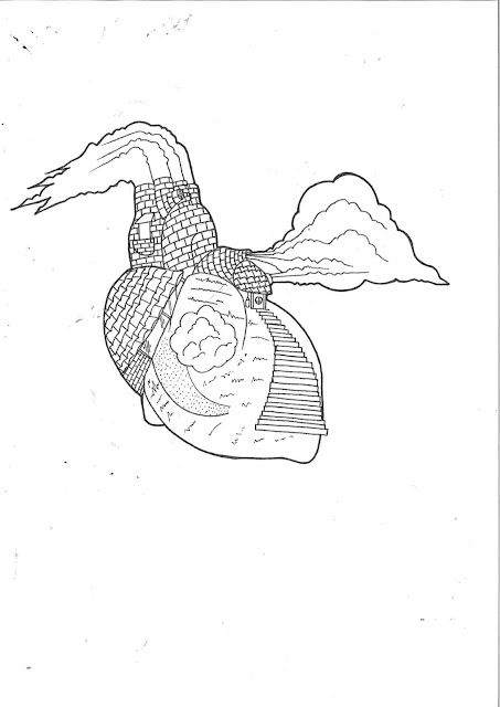

This illustration was inspired by the phrase "Home is where the heart is"
This illustration is combination of a home and a heart. What I did was literally drew a old fashioned house in the form of a heart.
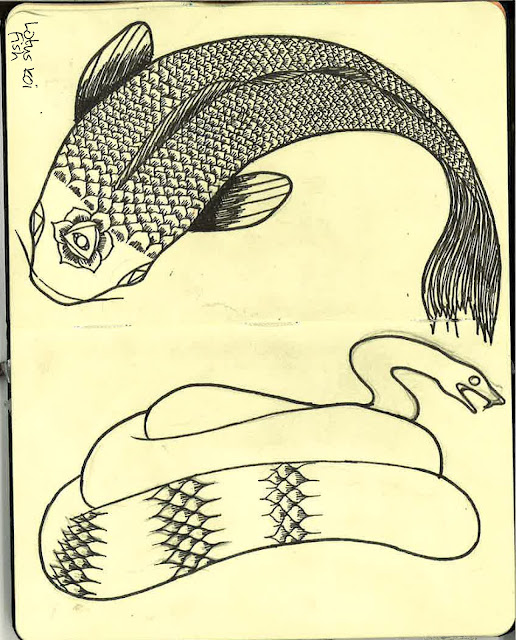
I liked the idea of using lotus flower instead of scales and so I thought of using it on a snake. The reason I chose a snake is because they are one of my favourite animals and because I believe they represent intelligence and a patience.
Development
Pastel experiment
This was done by using pastels and then smudged the colours with my thumb to get a gradient looking effect. I also used a small brush with water on some of the pastels just to see what the outcome would be. The reason I chose to experiment with pastels was because I wanted to create a colour scheme similar to tattoo.
Im pleased on how this experiment turned out to because I feel I achieved the goal I wanted to. I am surprised on how good it turned out to be because I do not have much experience with the media.
Water colour experiment
For these experiments I used water colours. Water colours have always been a traditional medium to use when it comes to illustration and I haven't really experimented with it before so this was an opportunity to apply it on to my work. My objective was for the designs to have a tattoo styled colouring scheme.
I think that this experiment didn't go so well because some of the colours are still solid in some places. I think this was because I didn't use enough water and used too much colour in some areas. From this experiment, I learned you have to establish a technique that involves balancing the amount of water you use with the amount of colour.
Mono printing experiment
I have encountered mono printing once before and revisiting this technique made me realise how difficult it is. The plan for this technique was simply to experiment with it and gather more ideas of what technique I can use to create my final outcomes.
The process of creating a mono print involves using a single colour of ink on an ink bed. Using a small roller, I evenly spread the ink to about an A3 size. Then, I used a double page spread of newspaper onto the ink bed, patted it down and pealed it off in order to take off excess ink off the ink bed. This was repeated twice after. I then placed my design, which was mirrored copy, on top of an cartridge paper and taped it down with masking tape. Finally, I used a mechanical pen to apply pressure and go over the lines of the design.
Photogram experiments
These experiments were very exciting to produce because I have never done anything of this sort before and this was a first for me.
What I did was I copied my design on a piece of tracing paper and gathered three pieces of photo paper. I switched the enlarger and adjust the red safety lens on. I turned on the safety light so that I can place the tracing paper on to the photo paper. I changed the seconds that will expose the design onto the photo paper from 3.5 to 2.5 seconds. I then turned off the safety light and adjusted the red lens off and pressed the button exposing the light onto my tracing paper onto the photo paper. Finally, I developed the photos by placing them into the developing chemicals.
The process for these experiment were the same but these were developed differently. Once the design was exposed to the photo paper, instead of placing the photo paper into the developing chemicals, I used a brush soaked in developing chemical to "paint' onto the paper.
The first image was created by splattering the chemical onto the photo paper. The third one was done by using brush strokes and the third one was done using the end of the brush and scribbling on the photo paper.
Sharpie on parcel paper
I used a light box and traced the outline of the skull I printed out on an A4 with a sharpie pen. I drew half the skull and added the details. I then scanned it onto Photoshop and mirror imaged it.
Adobe Illustrator
Here is development of the typeface I did using the pen tool. I used lines and shapes to create each letter and then outlined the stroke which then I added together.
I scanned this illustration onto Illustrator and live traced it as a detailed illustration. I then opened the illustration on Photoshop used a brush on 20% opacity to colour in the illustration. I found that using the paint brush on Photoshop is easy but it was hard to create the inky effect I wanted. I really enjoyed doing this because I have never tried to use the brush tool in such a way before.
Outcome Plan
I have decided to use both Illustrator and Photoshop to design my final plans. I will use Illustrator to live trace and define my drawing, then I will use Photoshop to paint and colour in my illustrations. I will also use Illustrator to develop and finish my logo.
As for presentation, my logo and typography will be presented on paper and 2 out of my 4 illustrations will be printed on t-shirts.
Mock Ups
Here are just a few mock ups of what different illustrations done in different techniques could look like on a t-shirt.
Evaluation.
My final outcomes are a logo and three
illustrations for t-shirt. The logo consists of a light jade green lotus flower
with a banner near the bottom with the name of the brand, THINK. The word INK has been coloured in a
gradient of red to yellow. The first illustration is of a skull, coloured in a
creamy colour and gradients of jade green and a grape purple coloured triangle
in the middle of its forehead. It has a banner underneath with the words Living
is hard. Dying is easy inside. The second illustration is of a house drawn in
the form of a heart with the saying Home is where the heart is inside a waving
banner. The final illustration is a of compass inside a bottle which also has
clashing waves. There is a banner underneath which has Travel beyond a reality
you know.
Originally, the plan was approach the designs in a traditional way, in order words hand illustrating the designs by hand and leave them in black and white. Instead the plan was to use Illustrator and Photoshop to finalise my designs.
Surprisingly, during the research I did, I was really influenced by Mike Giant and his work. But during the development, I wanted to add colour to great more depth to the illustrations so Ed Hardy became more influential due to detail in colour his work has.
I approached this project in a personal manner because I wanted to explore and develop my ideas to create t-shirt designs I have been planning on starting off during my spare time.
During my spare time, I had looked at all sorts of ways of seeking inspiration. My friend introduced me to Mike Giant and his artwork which really had a big impact in my decision to chose to do the illustration brief and approach it more personally. I research on four illustrators/ artists which include Mike Gaint, J.M. Smith, Ed Hardy and Andreas Pries who all have interested me with their detailed art work.
The experimentation made me realise that using traditional techniques to create my designs will be difficult because of the amount of time I had to produce my final outcomes. I had to consider the time I would spend on each illustration if I used traditional methods.
What I think went well was successfully creating the effect I wanted on Photoshop and solving the problem by using filters offered by Photoshop. What I found difficult while producing the outcomes was the amount of time I had to spend on each illustration. I had trouble trying to create a chalk pastel effect on Photoshop which was then sorted by using a softer brush in a lower opacity. What I think could of been improved is the composition of the illustrations on the shirt.
Unfortunately, the size of the designs on the shirt couldn't be any bigger due to the size of heat transfer paper, but they turned out better than I expected. The heat transfer added a faded effect, which made the illustrations look more like tattoo's which was pleasant surprise.


